认识数据分析
Visualization often plays a minimal role in the data science and model-building process, yet Tukey, the creator of Exploratory Data Analysis, specifically advocated for the heavy use of visualization to address the limitations of numerical indicators.
可视化通常在数据科学和模型构建过程中起着最小的作用,但是“探索性数据分析”的创建者Tukey特别提倡大量使用可视化来解决数字指标的局限性。
Everyone’s heard — and understands — a picture equals a thousand words, and following this logic, a visualization of the data is worth at least as much as dozens of statistical metrics, from quartiles to means to standard deviations to mean absolute errors to kurtosis to entropy. Wherever there is an abundance of data, it is best understood when it is visualized.
每个人都能听到并理解,一幅图片等于一千个单词,按照这种逻辑,数据的可视化至少值几十种统计指标,从四分位数到均值到标准差再到绝对误差,峰度到熵。 无论何时何地都有大量数据,最好以可视化方式理解。
Exploratory Data Analysis was created to investigate the data, emphasizing visualization because it was more informative. This short article will present one of the most useful tools in visual EDA and how to interpret it.
创建了探索性数据分析来研究数据,并强调可视化,因为它更具信息性。 这篇简短的文章将介绍可视化EDA中最有用的工具之一,以及如何解释它。
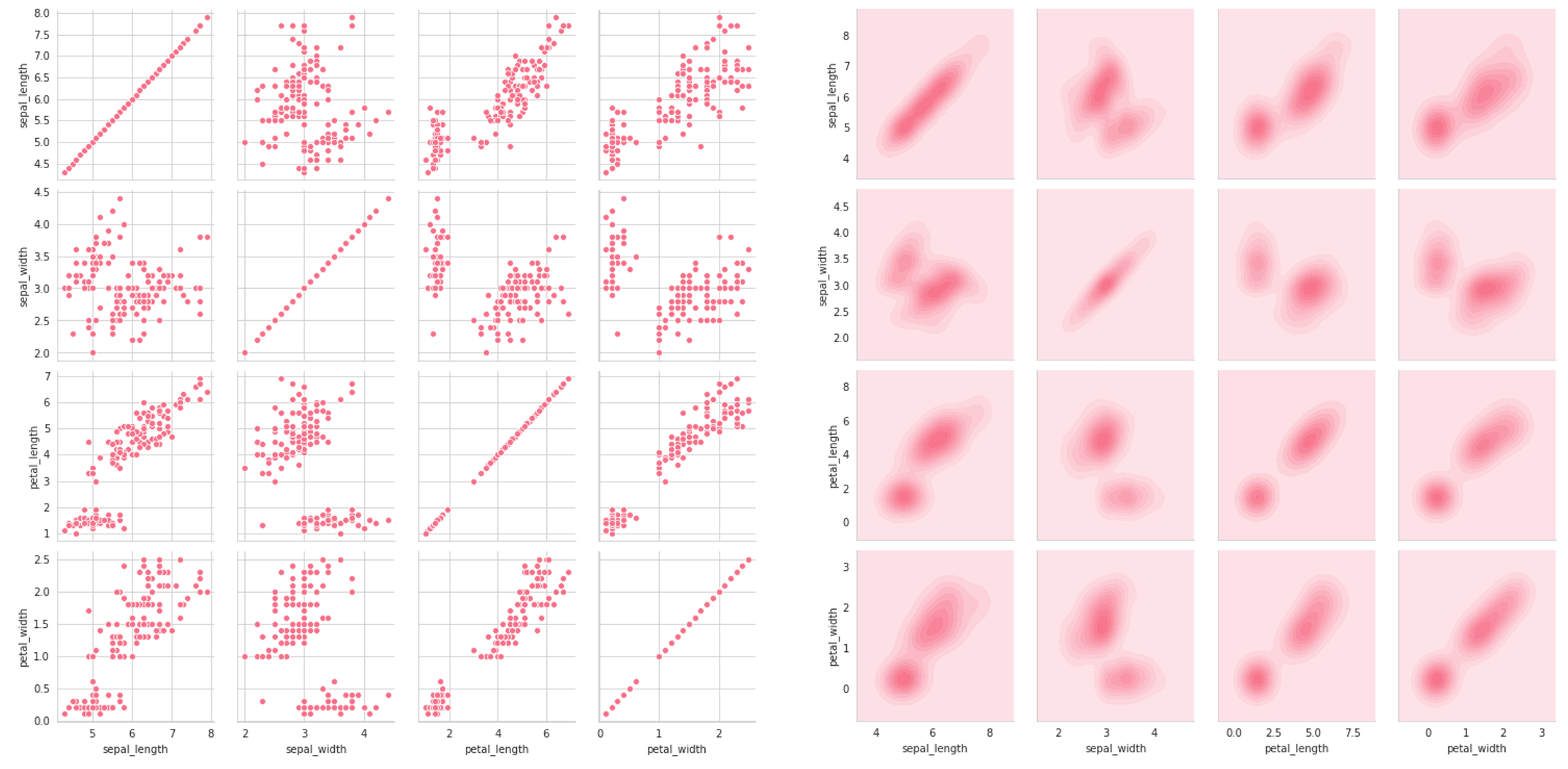
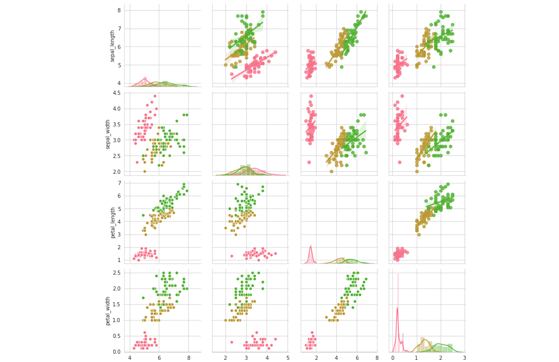
Seaborn’s pairplot is magical: at its most simple, it gives us a rich and informational visual representation of univariate and bivariate relationships within the data. For instance, consider two pairplots below, created with one line of code, sns.pairplot(data) (the second adding hue=’species’ as a parameter).
Seaborn的pairplot是不可思议的:最简单的说,它为我们提供了数据中单变量和双变量关系的丰富且信息化的视觉表示。 例如,考虑下面的两个pairplot ,它们由一行代码sns.pairplot(data) (第二个将hue='species'作为参数添加)。
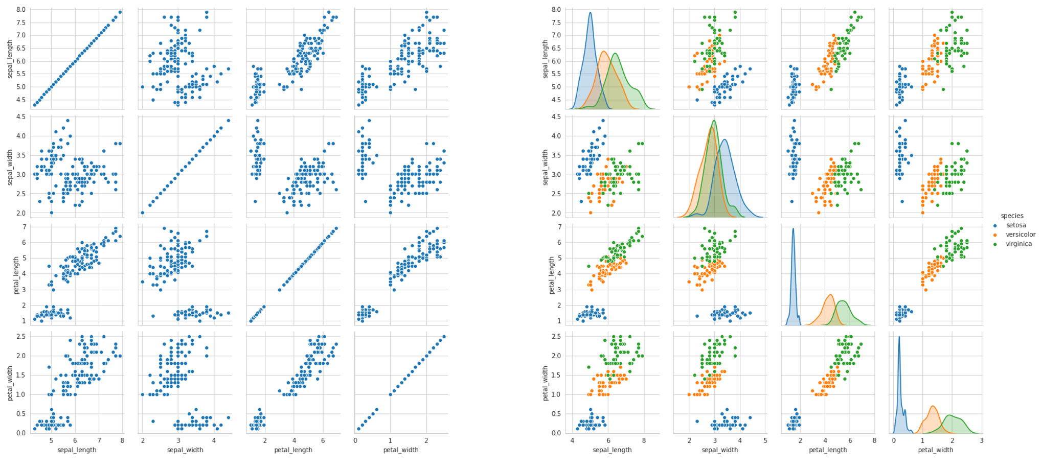
There’s so much information to be gleaned about the data, be it the success of classification (how much entropy/overlap is there between classes), potential results of a feature selection process, variance, and what the best choice of model may be, based on these observed attributes. The pairplot is like an unfolding of multidimensional space.
有关数据的信息太多,包括分类是否成功(类别之间存在多少熵/重叠),特征选择过程的潜在结果,方差以及最佳模型选择,这些观察到的属性。 对图就像多维空间的展开。
Usually, people stop at the one-liner pairplot, but with a few more lines or even words of code, we can reap even more information and insights.
通常,人们会停留在单线对图上,但是只要再增加几行甚至是代码的话,我们就可以获取更多的信息和见解。
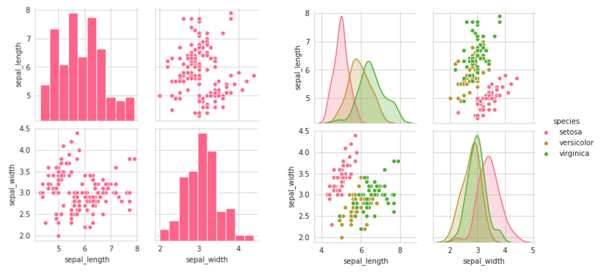
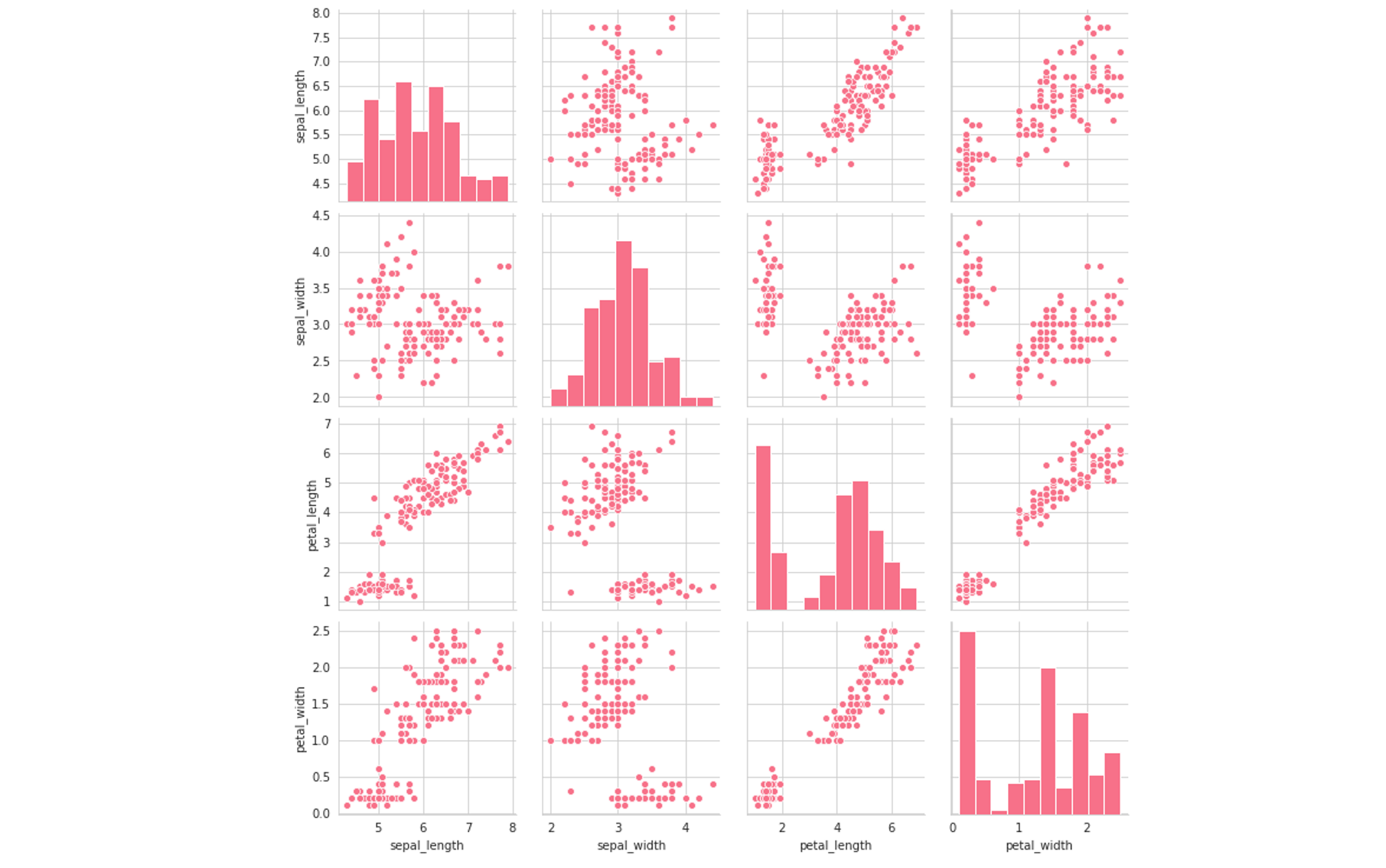
For one, pairplots can get notoriously large. To select a subset of the variables to be displayed, use the vars parameter, which can be set to a list of variable names. For instance, sns.pairplot(data,vars=[‘a’,’b’]) would only give the relationships between the two columns ‘a’ and ‘b’, being aa, ab, ba, and bb. Alternatively, one can specify x_vars and y_vars (each lists) to be the variables for each of those axes.
首先,成对的图可以变得很大。 要选择要显示的变量的子集,请使用vars参数,可以将其设置为变量名列表。 例如, sns.pairplot(data,vars=['a','b'])仅给出两列'a'和'b'之间的关系,即aa , ab , ba和bb 。 或者,可以将x_vars和y_vars (每个列表)指定为每个轴的变量。
The result of setting the first two plots (setting the vars parameter) is a symmetrical grid of plots:
设置前两个图(设置vars参数)的结果是一个对称的图网格:
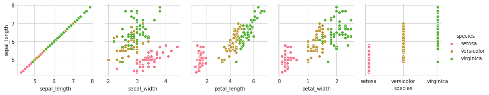
The third plot sets the y-component to only one variable — ‘sepal_length’ — and the x-component to all the columns of the data. This returns the interactions between that one column and all other columns. Note that for the first column — when it is paired against itself — and the fifth column — where it is paired against a categorical variable, the scatterplot is not an appropriate plot. We’ll explore how to deal with this later.
第三'sepal_length'图将y分量设置为仅一个变量'sepal_length' ,并将x分量设置为数据的所有列。 这将返回该一列与所有其他列之间的交互。 请注意,对于第一列(与它自身配对)和第五列(与类别变量配对),散点图不是合适的图。 稍后我们将探讨如何处理。
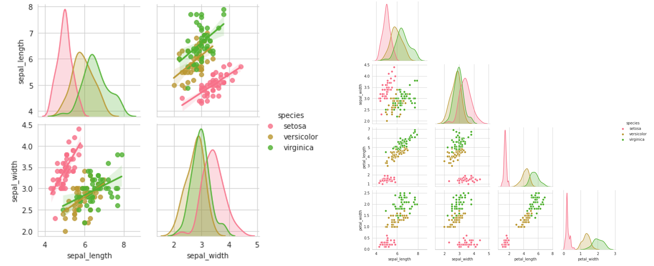
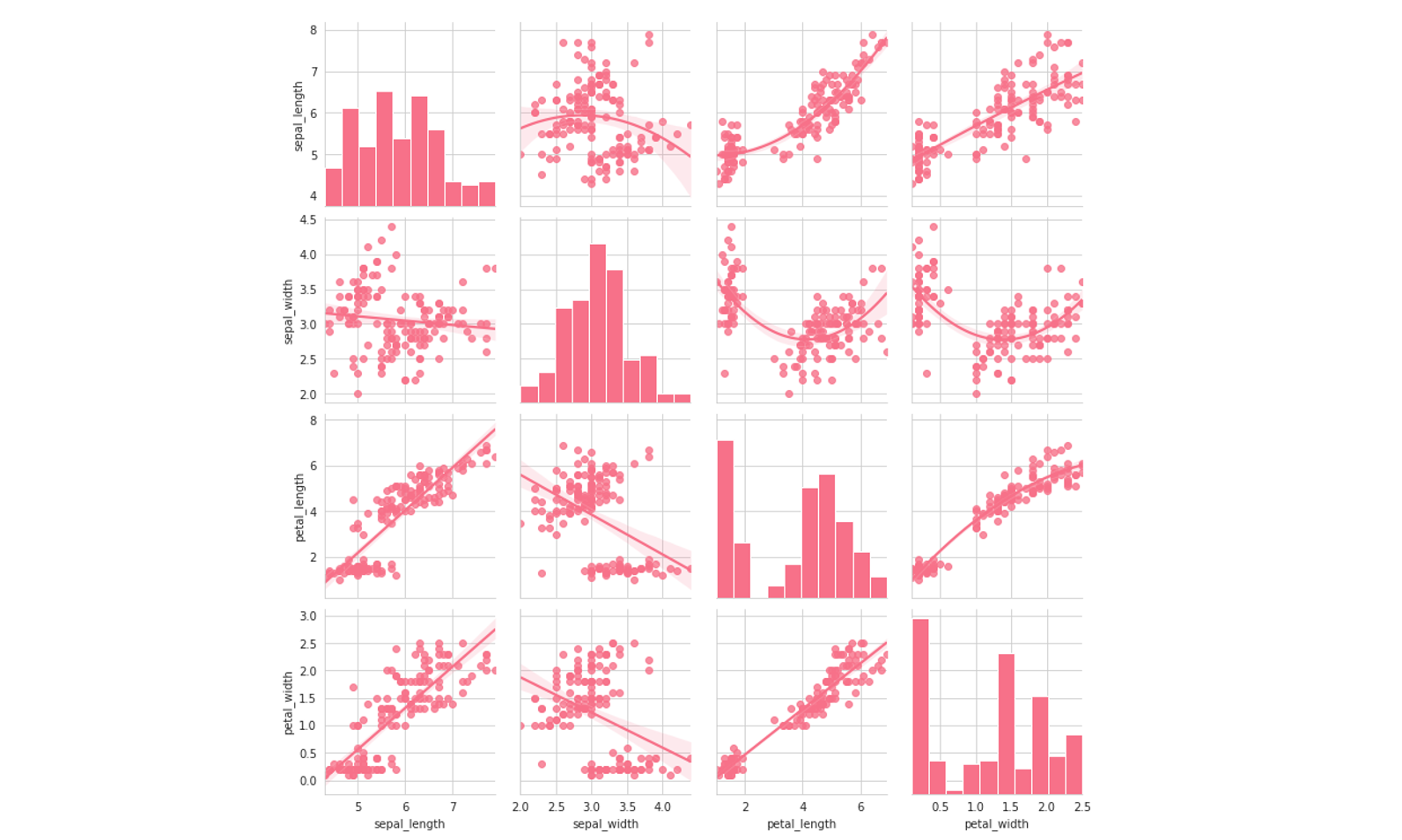
By adding a kind=’reg’ keyword into your pairplot, you can get linear regression fits for the data. This is a great gage as to the linearity and variance of your data, which can lead to decisions about which types of models, both supervised and unsupervised, to choose. Additionally, since pairplots are symmetrical, to a) declutter the plot and b) reduce long loading times, setting corner=True removes the upper-right half, which is a duplicate.
通过在您的对图中添加kind='reg'关键字,您可以获得数据的线性回归拟合。 对于数据的线性和方差,这是一个很好的衡量标准,它可以决定要选择哪种类型的模型,包括监督模型和非监督模型。 此外,由于成对图是对称的,因此要a)整理曲线图和b)减少较长的加载时间,设置corner=True将删除右上半部分,这是重复项。
The pairplot alone, however, is relatively limited in its ability to easily and intuitively display several relationships between variables. It is merely an interface to access the pairgrid, which is the real generator behind the ‘pairplot’. Properly handling visualization through pairgrid can yield valuable results.
然而, pairplot在其容易且直观地显示变量之间的几种关系的能力方面相对有限。 它仅仅是访问pairgrid的接口, pairgrid是“ pairplot ”背后的真正生成器。 通过pairgrid正确处理可视化pairgrid会产生有价值的结果。
Grids in seaborn are initialized to a variable, most commonly g (for grid).For instance, we may write g=sns.PairGrid(data). When grids are initialized, they are completely empty, but they will be filled in with visualizations soon. The grid is a method to access and visualize cross-feature aspects of the data in an efficient and clean way.
seaborn中的网格被初始化为一个变量,最常见的是g (对于网格)。例如,我们可以写g=sns.PairGrid(data) 。 初始化网格后,它们将完全为空,但是很快将被可视化填充。 网格是一种以有效且干净的方式访问和可视化数据的跨功能方面的方法。
We can use map methods to fill in the grid with data. For instance, calling g.map(sns.scatterplot) fills the grid with scatterplots. We can also pass in the model’s parameters: in g.map(sns.kdeplot,shade=True), shade is a parameter of sns.kdeplot but it can be specified in the mapping. Since this is a grid, all the data is sorted out; we only need to call the type of plot.
我们可以使用地图方法用数据填充网格。 例如,调用g.map(sns.scatterplot)用散点图填充网格。 我们还可以传入模型的参数:在g.map(sns.kdeplot,shade=True) ,shade是sns.kdeplot的参数,但可以在映射中指定。 由于这是一个网格,因此将所有数据整理出来; 我们只需要调用情节类型即可。
Note that the diagonals are still scatterplots. We can change this by using g.map_offdiag(sns.scatterplot) for plots not on the diagonal and g.map_diag(plt.hist) for plots on the diagonal. Note that we are able to use plotting objects from other libraries.
请注意,对角线仍然是散点图。 我们可以通过改变这个g.map_offdiag(sns.scatterplot)未对角和情节g.map_diag(plt.hist)的对角线上的地块。 注意,我们能够使用其他库中的绘图对象。
We can do one better. Since the top and bottom halves are identical, we can change the plot type between the top and bottom halves using g.map_upper and g.map_lower. In this example, we compare the fits of quadratic and linear regression on the same data by varying the order parameter in seaborn’s regression plot, regplot.
我们可以做得更好。 由于上半部分和下半部分相同,因此我们可以使用g.map_upper和g.map_lower在上半部分和下半部分之间更改绘图类型。 在此示例中,我们通过更改seaborn回归图regplot中的order参数,比较了二次回归和线性回归在同一数据上的拟合regplot 。
To specify a hue, we can add the hue=’species’ parameter into the initialization of the PairGrid. Note that we cannot do something like g.map(sns.scatterplot, hue=’species’) because mapping is simply a visualization of the data, not a reprocessing of it. All the data is processed in the initialization of the grid, so all things data-related must be processed then.
要指定色调,我们可以将hue='species'参数添加到PairGrid的初始化中。 请注意,我们无法执行g.map(sns.scatterplot, hue='species')因为映射只是数据的可视化,而不是数据的重新处理。 所有数据都在网格的初始化中处理,因此所有与数据相关的事物都必须进行处理。
Pairgrids are often used to build complex plots, but for the purposes of EDA, the operations covered should be enough.
Pairgrids通常用于构建复杂的地块,但就EDA而言,所涉及的操作应足够。
With a few more lines of code, you’ve been able to maximize the information gained from the pairplot and pairgrids. Here are some tips to take away as much insight as you can from it.
再多几行代码,您就可以最大化从pairplot和pairgrids获得的信息。 这里有一些技巧,您可以从中获得尽可能多的见识。
- Look for curvatures and transformations (e.g. Tukey’s ladder of powers) that can be used to improve model performance. 寻找可用于改善模型性能的曲率和变换(例如Tukey的幂阶)。
Approach features by how well they work in their entire row or column. For example,
petal_widthandpetal_lengthperform well in separating classes along their designated axis very well across all other features. The same cannot be said forsepal_width, where there is much overlap along their axis. This means that it provides less information, can may be good cause for us to run a feature importance and remove it if it provides a negligible boost in predictive power.通过功能在整个行或整个列中的性能来评估功能。 例如,在所有其他
petal_width,沿着它们的指定轴分隔类时,petal_width和petal_length性能很好。sepal_width不能说sepal_width,因为它们的轴上有很多重叠。 这意味着它提供的信息较少,如果它对预测能力的提升可忽略不计,则可能是促使我们发挥功能重要性并予以删除的良好原因。- Find how much data points vary from a regression fit (you can try different degrees as well) to get a visual understanding of how stable/stationary the data is. If data points vary widely from the fit and/or a fit must have a high degree to fit the data well, using methods like standardization or normalization may be helpful. 查找与回归拟合有多少不同的数据点(您也可以尝试不同的程度),以直观了解数据的稳定性/平稳性。 如果数据点与拟合值相差很大,并且/或者拟合度必须高度匹配才能很好地拟合数据,则使用标准化或归一化等方法可能会有所帮助。
- Spend a decent amount of time looking at visual bivariate representations of your data, playing around with comparisons and chart types. There are countless operations you can do to your data, and the purpose of EDA is not to give you answers but to spike your interest in taking a particular action. Data is different every time; no standard procedure fits all sizes. 花大量的时间查看数据的可视双变量表示形式,进行比较和图表类型。 您可以对数据执行无数操作,而EDA的目的不是给您答案,而是激发您对采取特定行动的兴趣。 每次数据都不一样; 没有适合所有尺寸的标准程序。
翻译自: https://towardsdatascience.com/meet-your-new-best-exploratory-data-analysis-friend-772a60864227
认识数据分析
本文来自互联网用户投稿,该文观点仅代表作者本人,不代表本站立场。本站仅提供信息存储空间服务,不拥有所有权,不承担相关法律责任。 如若转载,请注明出处:http://www.pswp.cn/news/388683.shtml 繁体地址,请注明出处:http://hk.pswp.cn/news/388683.shtml 英文地址,请注明出处:http://en.pswp.cn/news/388683.shtml
如若内容造成侵权/违法违规/事实不符,请联系英文站点网进行投诉反馈email:809451989@qq.com,一经查实,立即删除!相关文章

架构探险笔记10-框架优化之文件上传

matlab飞行数据仿真,基于MATLAB的飞行仿真

Windows Server 2003 DNS服务安装篇
版 - 北大未名BBS...)
正则表达式matlab,正则表达式中一个word的匹配 @MATLAB - 优秀的Free OS(Linux)版 - 北大未名BBS...

arima模型怎么拟合_7个统计测试,用于验证和帮助拟合ARIMA模型

jQuery禁止Ajax请求缓存

![[WPF]ListView点击列头排序功能实现](http://pic.xiahunao.cn/[WPF]ListView点击列头排序功能实现)
[WPF]ListView点击列头排序功能实现
)
天池幸福感的数据处理_了解幸福感与数据(第1部分)

标线markLine的用法

php pfm 改端口,罗马2ESF和PFM 修改建筑 军团 派系 兵种等等等很多东西的教程


wpf listview 使用
)
php 获取当天到23 59,js 获取当天23点59分59秒 时间戳 (最简单的方法)

詹森不等式_注意詹森差距

【转载】儒林外史人物——荀玫

WebM VP8 SDK Usage/关于WebM VP8 SDK的用法


数据分析师 需求分析师_是什么让分析师出色?
