最终效果
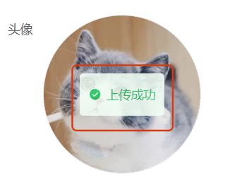
成功的提示
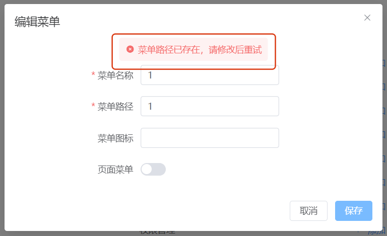
报错的提示
代码实现
components/SUI/S-msgWin.vue
<script lang="ts" setup>
const props = defineProps({msg: {type: Object,required: true,},top: {type: String,default: "50%",},duration: {type: Number,default: 3000,},
});
watch(() => props.msg,(newVal, oldVal) => {if (newVal.show) {setTimeout(() => {props.msg.show = false;}, props.duration);}}
);
</script>
<template><transition name="fade"><divv-show="msg.show"class="msgBox":class="{'border-#fde2e2 bg-red-50 text-#f56c6c': !msg.valid,'border-green-800 bg-green-50 text-green-500': msg.valid,}"><S-icon :icon="msg.valid ? 'ep:success-filled' : 'ix:error-filled'" /><div class="whitespace-nowrap">{{ msg.content }}</div><S-iconv-if="msg.closeable"class="c-#a8abb2 cursor-pointer"icon="material-symbols:close-rounded"@click="msg.show = false"/></div></transition>
</template>
<style scoped>
.msgBox {font-size: 14px;position: absolute;display: flex;flex-wrap: nowrap;align-items: center;gap: 6px;padding: 8px 10px;top: v-bind(props.top);left: 50%;transform: translate(-50%, -50%);z-index: 9999;border-radius: 4px;
}.fade-leave-from,
.fade-enter-to {opacity: 1;
}
.fade-leave-to,
.fade-enter-from {opacity: 0;
}
/* 定义过渡的持续时间和动画效果 */
.fade-enter-active,
.fade-leave-active {transition: opacity 0.3s ease;
}
</style>
依赖组件
components/SUI/S-icon.vue
<script setup lang="ts">
// 搜索图标 https://icon-sets.iconify.design/
import { Icon } from "@iconify/vue";
const props = defineProps({icon: {type: String,required: true,},
});
</script><template><Icon v-bind:="props" />
</template>
页面使用
在需要左右对齐的目标父容器中使用
<S-msgWin :msg="callbackMessage" />
const callbackMessage = ref({show: false,valid: true,content: "",
});
- show 是否显示
- valid 成功/失败(报错,未通过校验等)
- content 反馈的消息内容


进程的概念)


)


