目录
- 前言
- 一、线性布局(Column/Row)
- 1.先布局后内容
- 2.元素在主轴上的排列方式
- 3.元素在交叉轴上的排列方式
- 二、层叠布局(Stack)
- 1.开发布局
- 2.对齐方式
- 三、弹性布局(Flex)
- 四、创建列表(List)
- 五、创建轮播(Swiper)
- 1.基本用法
- 2.常用属性
- 3.样式自定义
- 六、选项卡Tabs
- 1.基本用法
- 2.常用属性
- 3.滚动导航栏
- 4.自定义TabBar
- 5.自定义TabBar-高亮切换
- 小米有品案例
前言
在 HarmonyOS 应用开发中,优秀的界面布局是用户体验的基础。ArkUI 作为新一代声明式 UI 开发框架,提供了丰富多样的布局组件和容器组件,帮助开发者高效构建复杂界面。本文将系统性地介绍 ArkUI 的核心布局方式,包括线性布局、层叠布局、弹性布局等基础布局,以及列表、轮播、选项卡等高级容器组件。
一、线性布局(Column/Row)
1.先布局后内容
容器组件:布局
Colum {} 内容会竖着排
Row() {} 内容会横着排
内容组件:内容
Text(‘内容’)
@Entry
@Component
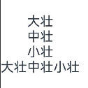
struct Index {build() { //里面要有唯一的容器根组件Column() {Column() {Text('大壮')Text('中壮');Text('小壮');}Row() {Text('大壮')Text('中壮');Text('小壮');}}}
}
2.元素在主轴上的排列方式
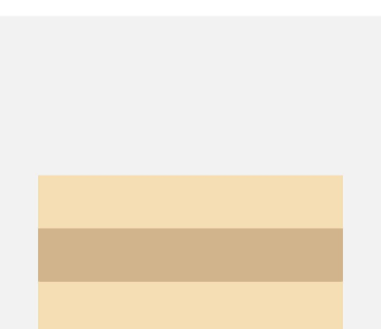
(1) Column:justifyContent(FlexAlign.xxx)
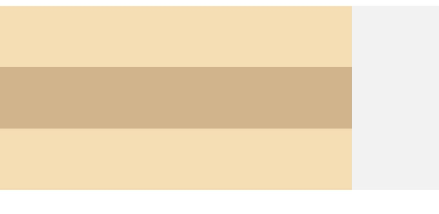
Column({}) {Column() {}.width('80%').height(50).backgroundColor(0xF5DEB3)Column() {}.width('80%').height(50).backgroundColor(0xD2B48C)Column() {}.width('80%').height(50).backgroundColor(0xF5DEB3)
}.width('100%').height(300).backgroundColor('rgb(242,242,242)').justifyContent(FlexAlign.Start)
Start
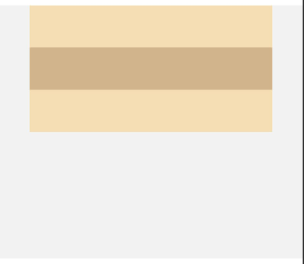
End
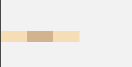
(2) Row:justifyContent(FlexAlign.xxx)
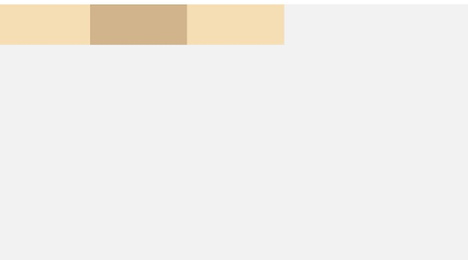
Row({}) {Column() {}.width('20%').height(30).backgroundColor(0xF5DEB3)Column() {}.width('20%').height(30).backgroundColor(0xD2B48C)Column() {}.width('20%').height(30).backgroundColor(0xF5DEB3)
}.width('100%').height(200).backgroundColor('rgb(242,242,242)').justifyContent(FlexAlign.Start)
3.元素在交叉轴上的排列方式
(1)Column:alignItems(HorizontalAlign.Start)
Column({}) {Column() {}.width('80%').height(50).backgroundColor(0xF5DEB3)Column() {}.width('80%').height(50).backgroundColor(0xD2B48C)Column() {}.width('80%').height(50).backgroundColor(0xF5DEB3)
}.width('100%').alignItems(HorizontalAlign.Start).backgroundColor('rgb(242,242,242)') //右对齐
(2)Row:
Row({}) {Column() {}.width('20%').height(30).backgroundColor(0xF5DEB3)Column() {}.width('20%').height(30).backgroundColor(0xD2B48C)Column() {}.width('20%').height(30).backgroundColor(0xF5DEB3)//上对齐
}.width('100%').height(200).alignItems(VerticalAlign.Top).backgroundColor('rgb(242,242,242)')
二、层叠布局(Stack)
1.开发布局
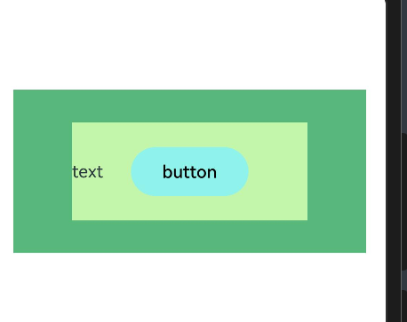
Stack组件为容器组件,容器内可包含各种子元素。其中子元素默认进行居中堆叠。子元素被约束在Stack下,进行自己的样式定义以及排列。
// xxx.ets
let MTop:Record<string,number> = { 'top': 50 }
@Entry
@Component
struct StackExample {build() {Column(){Stack({ }) {Column(){}.width('90%').height('100%').backgroundColor('#ff58b87c')Text('text').width('60%').height('60%').backgroundColor('#ffc3f6aa')Button('button').width('30%').height('30%').backgroundColor('#ff8ff3eb').fontColor('#000')}.width('100%').height(150).margin(MTop)}}
}
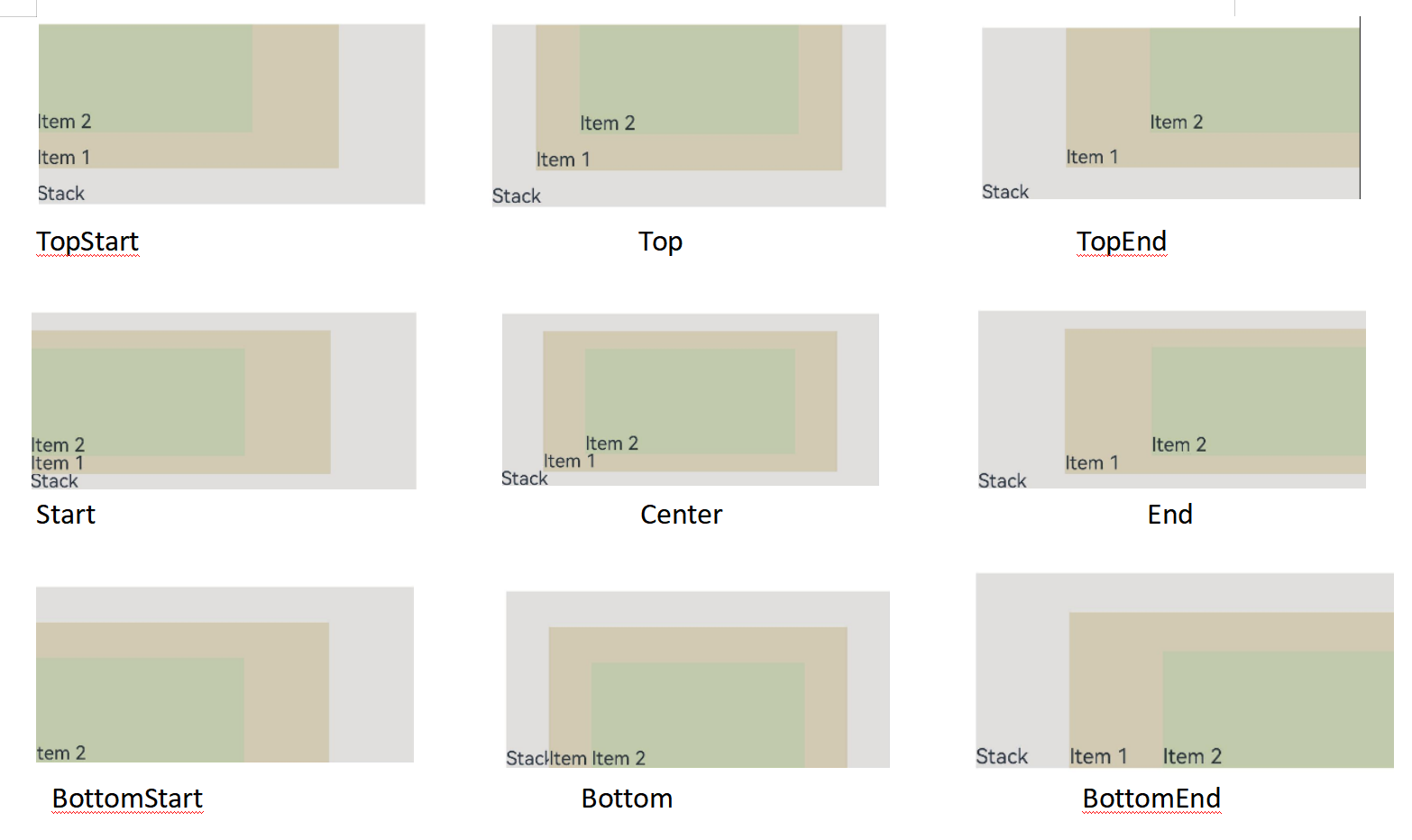
2.对齐方式
Stack组件通过alignContent参数实现位置的相对移动。如图2所示,支持九种对齐方式。
@Entry
@Component
struct StackExample {build() {Stack({ alignContent: Alignment.TopStart }) {Text('Stack').width('90%').height('100%').backgroundColor('#e1dede').align(Alignment.BottomEnd)Text('Item 1').width('70%').height('80%').backgroundColor(0xd2cab3).align(Alignment.BottomEnd)Text('Item 2').width('50%').height('60%').backgroundColor(0xc1cbac).align(Alignment.BottomEnd)}.width('100%').height(150).margin({ top: 5 })}
}
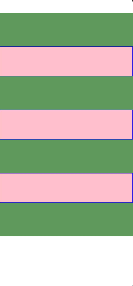
三、弹性布局(Flex)
弹性布局(Flex)提供更加有效的方式对容器中的子元素进行排列、对齐和分配剩余空间。常用于页面头部导航栏的均匀分布、页面框架的搭建、多行数据的排列等。
容器默认存在主轴与交叉轴,子元素默认沿主轴排列,子元素在主轴方向的尺寸称为主轴尺寸,在交叉轴方向的尺寸称为交叉轴尺寸。
@Entry
@Component
struct Index {build() {// Flex默认主轴水平往右,交叉轴垂直往下 -> Row// 1. 主轴方向 通过direction: FlexDirection.Row/Column来调整// 2. 主轴对齐方式 justifyContent// 3. 交叉轴对齐方式 alignItems// 单行或者单列的情况,优先使用线性布局(本质基于Flex设计)Flex({direction: FlexDirection.Column,justifyContent: FlexAlign.SpaceEvenly,alignItems: ItemAlign.Stretch //拉伸}) {Text().width(80).height(80).backgroundColor(Color.Pink).border({ width: 1, color: Color.Blue })Text().width(80).height(80).backgroundColor(Color.Pink).border({ width: 1, color: Color.Blue })Text().width(80).height(80).backgroundColor(Color.Pink).border({ width: 1, color: Color.Blue })}.width('100%').height(600).backgroundColor('#5f9a5c')}
}
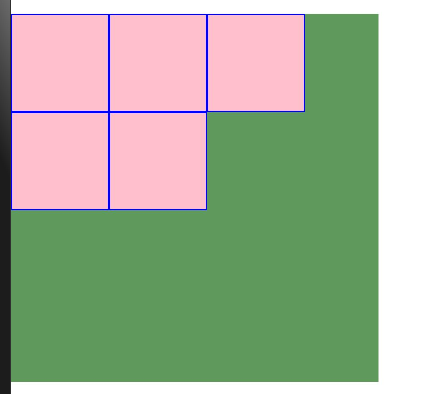
@Entry
@Component
struct Index {build() {// 4. 换行 wrapFlex({wrap: FlexWrap.Wrap// 换行}) {Text().width(80).height(80).backgroundColor(Color.Pink).border({ width: 1, color: Color.Blue })Text().width(80).height(80).backgroundColor(Color.Pink).border({ width: 1, color: Color.Blue })Text().width(80).height(80).backgroundColor(Color.Pink).border({ width: 1, color: Color.Blue })Text().width(80).height(80).backgroundColor(Color.Pink).border({ width: 1, color: Color.Blue })Text().width(80).height(80).backgroundColor(Color.Pink).border({ width: 1, color: Color.Blue })}.width(300).height(300).backgroundColor('#5f9a5c')}
}
案例:
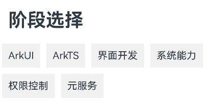
let names: string[] =['ArkUI', 'ArkTS', '界面开发', '系统能力', '权限控制', '元服务']@Entry
@Component
struct Index {build() {Column() {Text('阶段选择').fontSize(30).fontWeight(700).padding(15).width('100%')Flex({wrap: FlexWrap.Wrap}) {ForEach(names, (item: string) => {Text(item).padding(10).margin(5).backgroundColor('#f1f1f1')})}}}
}
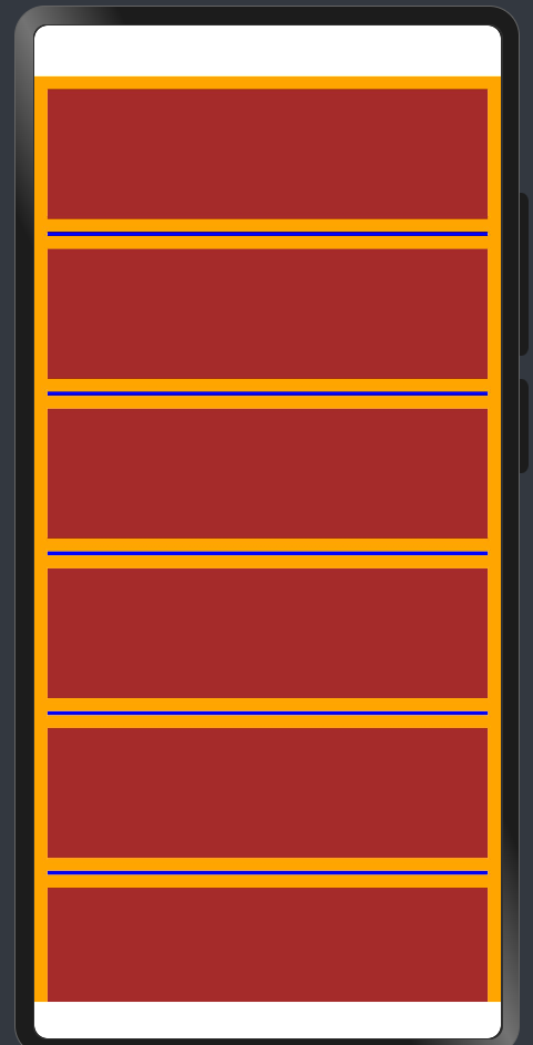
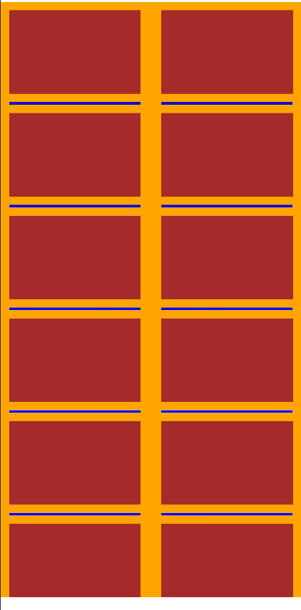
四、创建列表(List)
列表是一种容器,当列表项达到一定数量,超过List容器组件大小,自动滚动
| 主轴方向(垂直) | .listDirection(Axis.Horizontal) |
| 交叉轴布局 | lane(列数,间距) |
| 列对齐方式 | .alignListItem(ListItemAlign.Center) |
| 滚动条状态 | .scrollBar(Barstate.Auto) |
| 分割线样式 | divider({…}) |
@Entry
@Component
struct Index {build() {Column() {List() {ForEach(Array.from({length: 20}),() => {ListItem() {Row() {}.width('100%').height(100).backgroundColor(Color.Brown)}.padding(10)})}.width('100%').layoutWeight(1).backgroundColor(Color.Orange).listDirection(Axis.Vertical) //调整主轴方向.lanes(1, 5) //调整列数和间距.alignListItem(ListItemAlign.Center).scrollBar(BarState.Auto) //按需自动显示滚动条.divider({strokeWidth: 3, //线宽color: Color.Blue, //颜色startMargin: 10, //左边线距离边缘的间隙endMargin: 10 //右边线距离边缘的间隙})}.width('100%').height('100%')}
}
lanes(2, 5)
五、创建轮播(Swiper)
1.基本用法
Swiper() {// 1.轮播内容
}
// 2.设置尺寸(内容会自动拉伸)
.width('100%')
.height(100)
@Entry
@Component
struct Index {build() {Column() {Swiper() {Text('1').backgroundColor(Color.Orange)Text('2').backgroundColor(Color.Yellow)Text('3').backgroundColor(Color.Pink)}.loop(true) // 是否开启循环.autoPlay(true) // 是否自动播放.interval(2000) // 自动播放的间隔时间.vertical(false) // 横向.width('100%').height(100)Swiper() {Image($r('app.media.syt'))Image($r('app.media.wave'))}.width('100%').height(400)}}
}
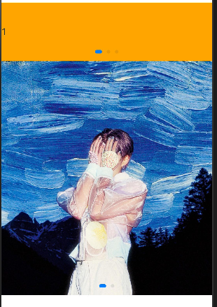
2.常用属性
| 属性方法 | 传值 | 作用 | 默认值 |
|---|---|---|---|
| loop | boolean | 是否开启循环 | true |
| autoPlay | boolean | 是否自动播放 | false |
| interval | number | 自动播放的时间间隔 | 3000 |
| vertical | boolean | 纵向滑动轮播 | false |
3.样式自定义
Swiper() {
}
.aspectRatio(2) //宽高比为2
.indicator(Indicator.dot()// 小圆点.itemWidth(20)// 默认的宽.itemHeight(20)//默认的高.color(Color.Black)// 默认的颜色.selectedItemWidth(30)//选中的宽.selectedItemHeight(30)// 选中的高.selectedColor(Color.White)// 选中的颜色)
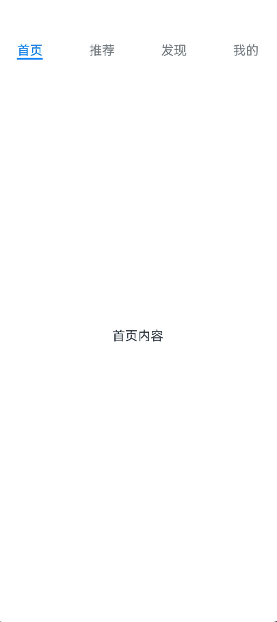
六、选项卡Tabs
1.基本用法
@Entry
@Component
struct Index {build() {Tabs() {TabContent() {Text('首页内容') //有且一个子组件}.tabBar('首页')TabContent() {Text('推荐内容')}.tabBar('推荐')TabContent() {Text('发现内容')}.tabBar('发现')TabContent() {Text('我的内容')}.tabBar('我的')}}
}
2.常用属性
| 名称 | 作用 |
|---|---|
| barPostion | 调整位置 :开头 或 结尾(参数) |
| vertical | 调整导航 :水平 或 垂直 |
| scrollable | 调整是否:手势滑动 切换 |
| animationDuration | 点击滑动动画时间 |
@Entry
@Component
struct Index {build() {Tabs({barPosition: BarPosition.Start}) {TabContent() {Text('首页内容') //有且一个子组件}.tabBar('首页')TabContent() {Text('推荐内容')}.tabBar('推荐')TabContent() {Text('发现内容')}.tabBar('发现')TabContent() {Text('我的内容')}.tabBar('我的')}.vertical(false) //选项横向排布.scrollable(false) //false为不支持手势滑动.animationDuration(0) //点击动画时间为0毫秒}
}
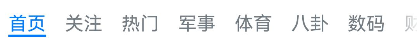
3.滚动导航栏
如果导航栏的内容较多,屏幕无法容纳时,可以将他设置为滚动
可以通过Tabs组件的barMode属性即可调整为固定导航栏或滚动导航栏
@Entry
@Component
struct Index {titles: string[] = ['首页', '关注', '热门', '军事', '体育','八卦', '数码', '财经', '美食', '旅行']build() {Tabs() {ForEach(this.titles, (item: string, index) => {TabContent() {Text(`${item}内容`)}.tabBar(item)})}.barMode(BarMode.Scrollable)//滚动导航}
}
4.自定义TabBar
@Entry
@Component
struct Index {@Builder myBuilder (title: string, img: Resource) {Column() {Image(img).width(30)Text(title)}}build() {Tabs({barPosition: BarPosition.End}){TabContent() {Text('购物车')}.tabBar(this.myBuilder('购物车', $r('app.media.ic_tabbar_icon_2')))TabContent() {Text('我的内容')}.tabBar(this.myBuilder('我的', $r('app.media.ic_tabbar_icon_3')))}}
}
![[图片]](https://i-blog.csdnimg.cn/direct/bff138534b304cb8a8ab14791a410653.png)
5.自定义TabBar-高亮切换
核心思路:
1.监听切换事件 -> 得到索引值,记录高亮的索引
2.给每个tabBar起个标记:0,1,2
3.在TabBar内部比较标记 == 记录的索引?高亮:不高亮
| 名称 | 功能描述 |
|---|---|
| onChange(event:(index: number) => void) | Tab页签切换后触发的事件;index:当前显示的index索引,索引从0开始;滑动切换、点击切换均会触发 |
| onTabBarClick(event: (index: number) => void) | Tab页签点击后触发的事件 |
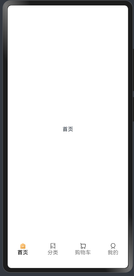
小米有品案例
@Entry
@Component
struct Index {@State indexNumber: number = 0;@Builder myBuilder(index: number, title: string, img1: ResourceStr, img2: ResourceStr) {Column() {Image(this.indexNumber == index? img2: img1).width(20)Text(title).fontColor(this.indexNumber == index? Color.Black: Color.Gray)}}build() {Tabs({barPosition: BarPosition.End}) {TabContent() {Text('首页')}.tabBar(this.myBuilder(0, '首页', $r('app.media.ic_tabbar_icon_0'), $r('app.media.ic_tabbar_icon_0_selected')))TabContent() {Text('分类')}.tabBar(this.myBuilder(1, '分类', $r('app.media.ic_tabbar_icon_1'), $r('app.media.ic_tabbar_icon_1_selected')))TabContent() {Text('购物车')}.tabBar(this.myBuilder(2, '购物车', $r('app.media.ic_tabbar_icon_2'), $r('app.media.ic_tabbar_icon_2_selected')))TabContent() {Text('我的')}.tabBar(this.myBuilder(3, '我的', $r('app.media.ic_tabbar_icon_3'), $r('app.media.ic_tabbar_icon_3_selected')))}.onChange((index: number) => {this.indexNumber = index})}
}

)


 219. 存在重复元素 II (哈希表))


)


